Agents Apr 15, 2024 < 1 min read
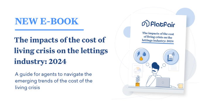
E-BOOK: The impacts of the cost of living crisis on the lettings industry 2024
The escalating cost of living has rapidly and significantly impacted the UK lettings industry. Agents are working…


As flatfair is growing and expanding in the market there was a need for a rebrand.
The following points support our decision to do so:

Old branding flatfair

New branding flatfair
How to decide on a new colour palette, the look and feel of the illustration style and the layout of the branding in general?
Uber, Dropbox, Slack, Airbnb and many other respectable companies bet on illustrations. The reason? They all believe that an illustration is not only an adornment to a product. It’s also a powerful tool that can help increase vital business metrics, eg. conversion rates and can cultivate a relationship that is more emotional, rather than just professional.
Well-designed illustrations can enhance your brand experience and help you to create a very personal connection with your users whilst distinguishing yourself from the crowd.
Illustrations are perceived faster than text so users may cover the key message quickly. That’s why illustrations can be good for landing pages, onboarding and tutorials.

A new style that can attract a broad audience
According to some studies, surprisingly, 84.7% of consumers say that “colour” is their primary reason for buying a specific product. That means companies choosing their brand colour palette have a big decision on their hands.
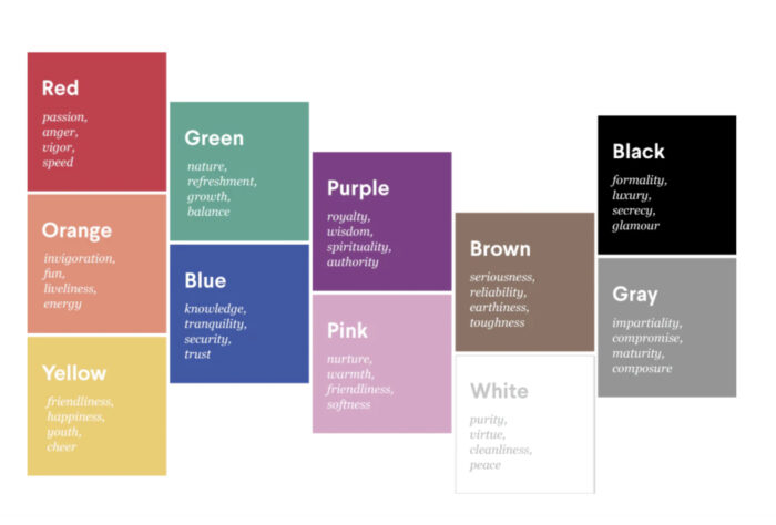
The meaning of different colours
A Branded House is the most common form of brand architecture. Major brands like Google and Apple are exemplary models of this style, wherein both have smaller sub-brands, but all are marketed and operated under the umbrella of the parent brand. For instance, you might check for appointments in your Google Calendar. Later, you write a message in Gmail. Tomorrow, you’ll complete a budget in Sheets. Each of these products is a sub-brand of the parent company, but they do not operate independently of one another, and they never overshadow the primary brand.
A House of Brands is the exact opposite of a Branded House. Whereas a Branded House maintains the focus on a single, well-known and consistent brand, a House of Brands is home to numerous brands, each independent of one another, and each with its own audience, marketing, look and feel. P&G and Unilever are great examples of a House of Brands.
flatfair’s new products fall under a Branded House architecture. flatfair acts as the primary brand and the new products (flatfair Boost and flatfair No Deposit) are sub-brands.

flatfair Branded House structure
To visualise the difference in both products we made use of different colours. Yellow is the primary colour for Boost and blue for No Deposit. This is translated in the benefit icons, graphic elements and logos.
![]()
flatfair benefit icons for Boost and No Deposit
Throughout the different assets there is a consistency in the colour palette, illustrations and geometrical shapes like circles, rectangles.

Social media banners
The escalating cost of living has rapidly and significantly impacted the UK lettings industry. Agents are working…
Deposit alternatives are becoming increasingly popular – in part due to the cost of living crisis. Tenants…